
Analysis of neighborhood commercial activity: a hands-on exercise with mercury-graph
Mercury-graph is an open-source Python library crafted to simplify the construction, exploration, and modeling of graphs (data networks). Its aim is to assist analysts and data scientists in working efficiently with graph structures by offering tools for interactive visualization, community detection, and advanced techniques such as embeddings and transition matrices.
Mercury-graph is particularly valuable as it can convert structured data into actionable insights by modeling implicit relationships. By utilizing the graph’s structure, patterns of connectivity, similarities among nodes, and emergent behaviors within the network can be identified. This is crucial in various applications, including business and market relationship analysis.
In this article, we will examine how to utilize mercury-graph in a practical scenario: analyzing commercial activities in a neighborhood. By representing businesses as nodes and their interrelations as edges in a graph, we will demonstrate how to extract pertinent information that can aid in understanding consumption patterns, identifying affinities between businesses, and enhancing recommendation and business expansion strategies.
Context of the problem: Exploring stores in an urban neighborhood
Cities are filled with small retail ecosystems. We can analyze consumption patterns and the relationships among businesses using graph techniques, which allows us to gain a better understanding of how these environments are structured and how they evolve over time.
One key aspect of this analysis is the interconnectivity of stores within a neighborhood. Customers typically visit various establishments based on their needs, preferences, and consumption habits.
In the following exercise, we will load the data, build a graph, visualize it, and apply techniques such as embeddings, which enable us to represent relationships in a mathematical space and identify similarities between businesses.
Hands-on: Explaining the dataset
The dataset we will use as an example, Comercios de Chamberí, represents the commercial activity of this emblematic neighborhood in Madrid through a graph structure. Each node signifies a business with attributes such as name, sector, average price, and turnover. The edges illustrate the relationships between businesses based on the number of customers they share.
By analyzing this network, we can answer questions such as: Which businesses have a similar clientele? Which type of business could benefit from collaborating with another? What are the commercial hotspots in the neighborhood?
This is an AI-generated dataset, designed with a few businesses to illustrate the use of the library, maintaining a realistic structure based on commercial relationships.
Hands-on: We install the library
To follow this hands-on activity, we recommend using Jupyter Lab, as it will allow us to visualize the graphs in an interactive manner. If you haven’t installed it yet, you can do so with:
pip install jupyterlab anywidget
After installation, you can start it using:
jupyter lab
In addition, we will install the mercury-graph library, which we will use in the examples. To run each code snippet in this tutorial, create a new notebook in Jupyter Lab and run the following cell:
!pip install mercury-graph
Hands-on: Loading the data
The next step is to load the Comercios de Chamberí dataset, which is available in CSV format. We will use pandas, a widely used Python library for data manipulation.
The dataset consists of:
- Nodes: represent the stores and include information such as name, sector, average price, and turnover.
- Edges: represent the relationships between stores, i.e., how many customers have visited both establishments.
We can load the data directly from the CSV files hosted in the project repository:
import pandas as pd

nodes = pd.read_csv('https://raw.githubusercontent.com/BBVA/mercury-graph/refs/heads/master/tutorials/data/chamberi_nodos.csv', sep = '\t')

edges = pd.read_csv('https://raw.githubusercontent.com/BBVA/mercury-graph/refs/heads/master/tutorials/data/chamberi_aristas.csv', sep = '\t')
Hands-on: Building the graph
We can create the graph using mercury-graph in one line with the data loaded.
import mercury.graph as mg

G = mg.core.Graph(edges, keys = {'directed': False}, nodes = nodes)
In this case:
- edges define the connections between the nodes, indicating how many clients are shared by two businesses.
- nodes, which is an optional argument, contains detailed information about each business.
- keys represent a dictionary of column names; in this case, they are already the ones expected by mercury-graph.
Additionally, {‘directed’: False} indicates that the network is undirected, meaning the relationship between the businesses is bidirectional.
Hands-on: We explore it visually
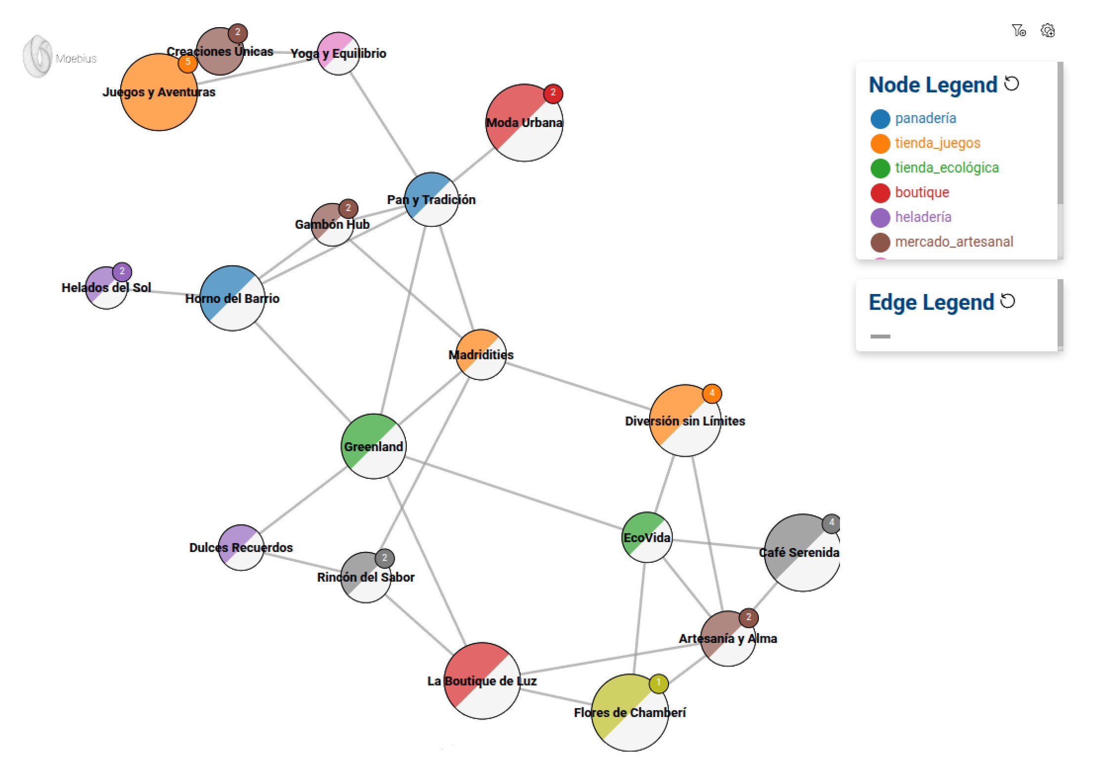
To visualize the graph, we will use Moebius, the mercury-graph visualization module. We will create a basic configuration that will allow us to inspect the network of stores.
M = mg.viz.Moebius(G)

node_conf = M.node_or_edge_config(text_is = 'id', color_is = 'actividad', size_is = 'facturación', size_range = [20000, 100000])
edge_conf = M.node_or_edge_config(text_is = 'weight')

M.show('Greenland', 2, node_conf, edge_conf)- Moebius(G) initializes the display on the graph.
- node_or_edge_config defines how nodes and edges are displayed.
- text_is=’id’: shows the identifier of each node.
- color_is=’actividad’: assigns a different color depending on the business activity.
- size_is=’facturación’: adjusts the size of the node according to its turnover, with values between 20,000 and 100,000.
- M.show(‘Greenland’, 2, node_conf, edge_conf) allows us to explore the graph starting from the Greenland node and expanding to its neighbors in two levels.
This provides us with an interactive visualization of the network, enabling us to begin analyzing business relationships. We can experiment with it to become more familiar with the dataset and the library.
Hands-on: Edges seen as customer movements
So far, we have illustrated the relationship between stores using a graph in which the edges indicate how many customers have visited both establishments. However, this data only reflects a small part of reality: We know some customers share stores, but not all of them. How can we estimate additional relationships with the limited information we possess?
This is where we introduce a key idea: modeling customer movements as a Markov chain. Based on the observed data, we can envision a customer moving from one store to another with a specific probability. In other words, if two stores share customers, it is likely that a customer from the first store will also visit the second store.
To do this, we transform our graph into a transition matrix, which indicates how likely it is that a customer will move from one store to another in a single step. Interestingly, we can extend this concept: by repeatedly applying the transition (following the logic of friends of my friends are my friends), we can uncover indirect relationships between stores that initially seem unconnected.
This is useful because it helps us regularize the dataset, smooth the limited information we have, and make better inferences. Although we only directly observe a few customer movements, this technique allows us to extend knowledge and estimate connections that would be evident if we had a more complete view over time and more purchase data.
To transform our graph into a transition matrix and begin examining these customer movements, we use mercury-graph as follows:
T = mg.ml.Transition().fit(G)
T.to_pandas()
This provides a representation of customer flow between stores, which we can use to simulate paths and analyze the proximity of stores beyond the original data.
Hands-on: Customer journey simulation
In the previous step, we constructed a transition matrix that indicates the probability of a customer moving from one store to another in a single step. But what if we want to analyze customer journeys after several moves? Specifically, we are interested in where customers might go after visiting a store and where they might end up after several intermediate steps.
Mathematically, this is equivalent to raising the transition matrix to a power. For example, when we multiply the matrix by itself 10 times (i.e., raise it to the power of 10), we obtain a new matrix that reveals the connections that exist after 10 steps of client movement.
Why is this useful? Because it enables us to uncover new relationships between stores that were not apparent in the original data. If, after 10 steps, there is a high probability that a customer ends up in a store with which they initially had no direct connection, we could consider those stores to have a strong relationship and add a new edge to the graph.
This would enrich the dataset, simulating how customers might move if we had more data. With mercury-graph, we can compute this simulation with:
T.to_pandas(10)This returns a matrix of transition probabilities after 10 steps, enabling us to identify new relevant connections between stores. These connections can be used to enhance recommendations, analyze consumption patterns, or even redesign commercial strategies based on the affinity among stores.
Hands-on: Embeddings
Up to this point, we have examined the relationships between businesses using graphs and transition matrices. Now, we will introduce another powerful tool: embeddings.
An embedding represents each node (in this case, each store) mathematically, in the form of a vector within a high-dimensional space. The idea is that these vectors reflect the network’s structure: stores that are connected or share similar paths should have similar embeddings.
How are embeddings calculated?
Initially, each business receives a vector of random numbers that lacks any useful information. Subsequently, the embeddings algorithm trains these vectors by simulating random paths through the network. During this training:
- If two stores appear frequently on the same paths, their embeddings are close.
- If two businesses rarely meet on the same roads, their embeddings will be far apart.
Over time, these vectors stop being random and start to reflect the structure of the network; they capture relationships that might not be obvious to the naked eye.
The real power of embeddings is in how we can use them:
- Similarity: We can determine which stores are most similar by evaluating the distance between their embeddings.
- Pattern search: Businesses with similar embeddings may exhibit shared behaviors or target the same audiences, even if they are not directly linked within the network.
- Arithmetic relations: In some cases, we can even perform operations with embeddings to discover new relationships.
Using mercury-graph, we can calculate the stores’ embeddings like this:
E = mg.embeddings.GraphEmbedding(dimension = 50, n_jumps = 1000).fit(G)

E.embedding().as_numpy()
Here, dimension=50 means that each business will be represented with a vector of 50 numbers, and n_jumps=1000 indicates that we will simulate 1000 random walks through the network to train the embeddings.
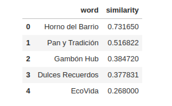
Once calculated, we can use them to find similar businesses:
E.get_most_similar_nodes('Greenland') This will return a list of businesses most similar to “Greenland” according to the graph structure, allowing us to make recommendations, detect hidden communities, and analyze consumption patterns.
A little further: community detection with Louvain
Beyond analyzing similarities between stores, we can take it a step further by identifying communities within the network. A well-known method for this is the Louvain algorithm, which groups nodes by comparing the density of their internal connections to external ones.
This method is useful for identifying groups of stores with high affinity for each other, which could help in segmentation strategies or market analysis. However, its implementation requires handling larger datasets and using tools such as Spark, PySpark, and GraphFrames, which is beyond the scope of this hands-on.
If you wish to explore it in a different context, you can do it with a single line of code:
L = mg.ml.LouvainCommunities().fit(G)Conclusions
In this hands-on, we have seen how graphs can help us discover patterns in business data beyond what would be possible with traditional table-based approaches.
Using mercury-graph, we were able to:
- Build and visualize a network of businesses based on shared customers.
- Explore how customers can move between establishments using a transition matrix.
- Use this model to estimate new relationships between businesses beyond the observed data.
- Apply embeddings to represent the graph structure in a mathematical space and find similarities between nodes.
In addition, we mentioned how advanced techniques such as Louvain could help us detect communities within the network in broader analyses.
This exercise has just introduced all that can be done with mercury-graph. In real problems, we could apply these techniques to optimize commercial strategies, improve recommendations, or better understand market dynamics. Graph analysis is a powerful tool, and with mercury-graph, its implementation in Python is more accessible than ever.